Wikimecum:The History of Infographics
Information graphics are anything that is used to display knowledge or data visually. The use of infographics has been well known throughout history. For centuries, people have been using graphics to show their audience the information they want known. Graphics can be traced back to ancient civilizations that drew pictures to tell their stories all the way to present day where companies and organizations use graphics for presentations and policy decisions.
Information Graphics before Computers
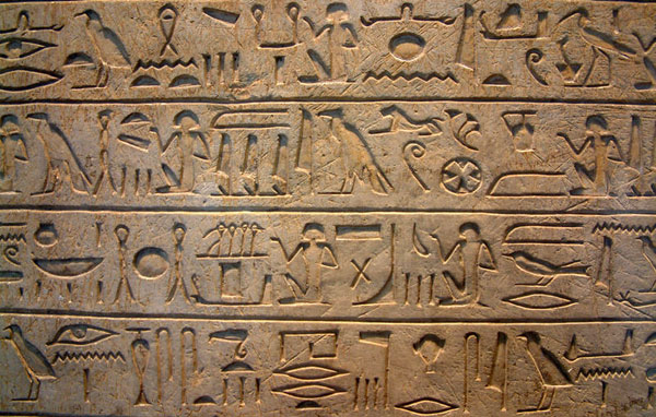
In early history, prehistoric civilizations used cave drawings to depict a story. These could be considered the first known information graphics. These images were called petroglyphs. These graphics were used for a variety of things, such as keeping track of cattle and sheep. Later, the early civilizations began to draw maps. One example is the map at Çatalhöyük which dates back to around 7500 BCE. These graphics are an invaluable tool for looking back at the history of ancient civilizations. The earliest form of writing began with the scratching of pictures on clay tablets and walls. This method was perfected by the ancient Egyptians in 4000 B.C with the use of hieroglyphics. The hieroglyphs were used to decorate the walls of the temples. They were also used in the tombs of the pharaohs in order to show the pharaohs the way into the afterlife and help them to make it through all the gates. They have taught the historians about the culture of the ancient civilization.

The Renaissance is the next example of authors trying to coherently mix graphics and text. During the Renaissance, many artists and scientist flourished including Leonardo da Vinci, Copernicus, and Galileo. All three of these scientists used graphics and images to display their information in order for the people to better understand their theories. The renaissance brought about change in art and science. It created new ways for art to be displayed, which has influenced artists since then. During the Renaissance, an important invention that has influenced graphics is the invention of the printing press in the 15th century. Johann Gutenberg first used the printing press to publish the bible. Gutenberg printed approximately 200 bibles which were then sold at the 1455 Frankfurt Book Fair. The printing press spread rapidly; in 1500 more than 2500 European cities had printing presses. “The printing press certainly initiated an "information revolution" on par with the Internet today. Printing could and did spread new ideas quickly and with greater impact.” This invention made the spread of ideas much faster as well as the spread of art. The art could then be combined with the texts which lead to the first newspaper in 1605. Johann Carolus published the first printed newspaper, Relation, in Strasbourg, which is now part of France.
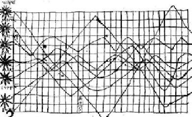
The earliest graphical depiction was in the 10th century by an anonymous author, which showed the changing of the seven prominent bodies of space over time. The vertical axis represents the inclination of the planetary orbits and the horizontal axis shows time which was divided into thirty intervals. Following, in the 14th century was the idea of a proto bar graph which showed the relationship between values in a table. This graph was published by Nicole Oresme Bishop of Liseus. As well, we see the use of the camera obscure by Reginer Gemma- Frisius in 1545 to record an eclipse of the sun and the first modern cartographic atlas by Teatrum Orbis in 1570. These things combined to show the early ages of data visualization.

The 1800s was the beginning of graphics that are still used today. In 1825, the Ministry of Justice in France instituted the first centralized national system of crime reporting, collected quarterly from all departments and recording the details of every charge that came before the French courts. In 1855, Dr. John Snow produced his famous dot map showing deaths due to cholera. This was indeed a landmark graphic discovery that marks a high-point in the application of thematic cartography to human topics. By the mid-1800s, all the conditions for the rapid growth of visualization had been established. Official state statistical offices were established throughout Europe, in recognition of the growing importance of numerical information for social planning, industrialization, commerce, and transportation.
William Playfair is another person who created information graphics before computers. He was a Scottish political economist, who Edward Tufte credits as one of the greatest inventors of modern graphical design. The graphic showed whether or not the price of wheat had changed relative to the increase in wages. His graphic is an example of a time-series graph. The graphic shows prices of wheat, wages, as well of the reigns of kings and queens. It covers the time period of 1565-1821. This graphic is important because it is one of the first bar graphs created.
The Rise of the Modern Infographic
By the early 1900s statistical graphing and visualization of complex information was no stranger to scientists and mathematicians alike. The year 1910 marked the first English textbook dedicated to the sole purpose of creating representative and accurate depictions of data. With The Construction of Graphical Charts, John Bailey Peddle, a professor of machine design at the Rose Polytechnic Institute set the standard for future generations of information designers. Peddle’s book is heavy on mathematical formulas and complex graphing techniques, but is nevertheless a great stepping stone for future information graphic design publications.
Shortly after the First World War, Otto Neurath, an Austrian philosopher with a team of artists and data specialists, created the first symbolic pictorial language for conveying information. The Isotype (International System of TYpographic Picture Education) project had the specific goals of creating awareness of a war ravaged country’s suffering economy and educating ordinary Austrians in public affairs in order to motivate social change. Isotype was the first true abstract representation of data in a way that people could readily understand. By establishing this new pictorial language of sorts, Neurath and his circle of information designers launched an entirely new thought process for looking at data. Isotype proved that when information is portrayed with human perception in mind, complex data can be more effectively and efficiently communicated to a wider audience. As seen in the figure at left, the use of pictograms is ubiquitous in today’s modern infographics.
An important development in technology that would later define the entire genre of infographics was the debut of the fully automatic computer in 1944. The IBM Automatic Sequence Controlled Calculator, also known as the Mark I computer, was the first computer that did not require human interaction once it started. Weighing in at over five tons and about 50 feet long, the massive electromechanical calculator was proposed by a Harvard graduate student named Howard H. Aiken. Seizing the opportunity to head the development of the milestone technology, IBM provided Aiken with staff and resources to complete his vision. The computer was completed in February of 1944 and presented to Harvard University on August 7th of the same year. The Mark I was used by the Navy during World War II to populate military calculation tables and charts, and after the war to aid in solving complicated calculations across many fields. The digital age had officially begun.
The 1960s saw an important development in how we analyze and visualize spatial data. The first fully operational Geographic Information System (GIS) was employed in Canada to manage and study information collected in the Canadian Land Inventory.
GIS provided a fast, accurate, and useful means of creating cartography-based graphics – so useful infact that over 15,000 maps were produced making it one of the largest repositories of spatial information on Canada available today. Geographic Information Systems provide an important tool for visualizing spatial information and have played a large role in influencing modern infographics and have been continuously improved over the years.
While information graphics became more ubiquitous across print and media sources, the availability of software to create more sophisticated infographics increased drastically. The processing power and widespread popularity of personal computers were the perfect venue for graphic software to be available to the masses. As the digital age progressed and businesses began to adopt computers into the normal work day, information graphics – bar charts, line charts, pie charts – were now able to be produced by anyone. The obvious problem with this was that software users had no graphical design sense when constructing these graphics, resulting in a steady stream of mediocre data visualizations. This situation was particularly interesting because with the advent of sophisticated computer software, our society actually regressed to some degree and lost sight of the years of statistical glory once exuded by the likes of Charles Joseph Minard and William Playfair.
The Modern Era of Infographics and Beyond
During the early 2000’s the foundations for a fundamentally different kind of internet blossomed into what is now called Web 2.0. Specifically a convergence of underlying technologies and social paradigm shifts has allowed the Internet to develop into the medium it is today. As this evolution of the medium has progressed the expectations of end users has grown from a passing interest to a ravenous hunger for data and meaning.
Web scripting languages began to grow in usage which allowed developers increasingly dynamic control over what were still very traditional websites. Technologies such as Adobe’s Flash enabled artistic and graphically designed interfaces to create a new layer of interaction between users and web pages. Social interaction through the internet was fostered as the complexity of these technologies proliferated and the internet install base reached critical mass in developed nation. By utilizing this new potential websites such as Myspace.com and Facebook.com have revolutionized the way millions of people interact with each other and the internet.
The new social internet culture has given the means of infographic production and to anyone who wishes to use them. While tools such as Adobe’s suite of products still dominate the top tier of graphic design, open source and freeware programs such as GIMP are democratizing professional grade tools. These trends are currently working to accelerate the speed and beauty of the way people find information in their daily lives.